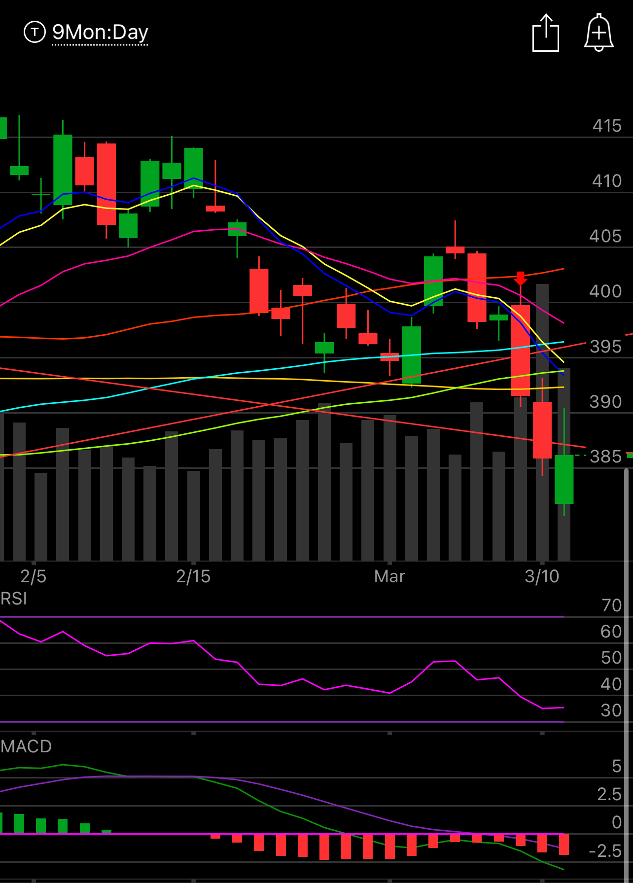
3/13 Recap.
Although we had a nice recovery today, the market remains very broken.All the moving averages are sloping down and for the time being all moves up should be opportunities to sell longs into. As of right now with a little under an hour to go in the day you can see below that although we recovered, we couldn’t hold above the downtrend line from the yearlong trend we were in, we are still well below the uptrend we just broke down from, so this is not bullish. As you can see, we are still below every moving average on my chart meaning this bounce is just a meaningless one. These moves take time to unfold. In order to reverse significantly higher you need to see the moving averages stop sloping down, flatten out, and a few closes above them. We aren’t close, so I maintain this is just no man’s land for now.
For those wondering how the bank disaster coincided with the breaking of the uptrend, it’s simple to explain. Larger players in the market knew the bank disaster was coming and were slowly pulling money out, by the time retail investors knew the breakdown was already underway. That’s why I always say the charts tell the truth, they’re showing the flow of money and all last week I was warning you that we were getting close to a breakdown and when that breakdown happened, it was time to de-risk. The bank collapse becoming public was just what the charts were showing you becoming known to all and the followthrough we’ve seen is just normal action.
Tomorrow morning we get CPI data and at this point it’s hard to say anything more than the market is starting to believe the fed is going to cut rates. I actually think the opposite as yesterday cleared the path for the fed to continue hiking and boost QT but nearly every mega cap tech name posted a bullish engulfing candle today. If you remember the trends I’ve been posting the last few weeks you saw atop the list names like Amazon,Google,Meta and although they were weak for a long time, the trends play out over longer periods and those names now look like places people are flocking to for safety. We will have to see what CPI brings tomorrow.
Trends
I get a lot of questions on how to use these trends. It’s fairly simple, these trends are just a compilation of the daily tables I post below. 2 weeks and 4 weeks just to show some names maybe have been hotter shorter term. They’re showing the amount of net unusual sized bullish/bearish trades in a name. For me as a put seller, I just look at the charts, look at where key trades have been placed and how they correlate to moving averages/gaps on a chart. From there I decide where to sell puts to get long a name that is seeing strength. You have to put the 2 together. There’s many here that see options flows but the charts are bad, I skip those and try to find names where the 2 align to give me better odds of a successful trade. This is only trades that are not expired and I always post the closer looks of the hot names throughout the week below.
Look at something such as ILMN, I had noted that name multiple times last month and said many times something was brewing there, today we got news Carl Icahn took a stake. I wish I had the guts to play a biotech like that but I did not, the flows didn’t lie. How many times have we seen something like this in the last year for those of you who have been here that long? This isn’t the first and it won’t be the last. Last week the bank puts were exploding on Wednesday before the implosion on Thursday and I even mentioned how odd it was in the recap. It’s uncanny how dirty the options market can be.
2 Week Trends


