
6/11 Strong Chart Setups For The Week Ahead

I have some strong chart setups I want to share but before I do, I want to go deeper into what charts are what I mean when I say “ a strong chart setup” for those that still don’t get the importance or those who are new here. A chart is simply a map of what is being bought or sold, and each little candle on the chart is telling you a story within a story. Why is this significant? Well, you don’t want to buy a stock that is being sold by bigger players, right? So when these people on twitter tell you they’re a “long term investor” and don’t care about charts, they’re just telling you that they’re ignorant and lazy. My goal is to outperform, not perform inline or worse underperform. You can’t outperform if you waste your time being dense about being long a weak stock. There is a classic example of this going on right now, a stock that is “cheap” and finwit LOVES it.
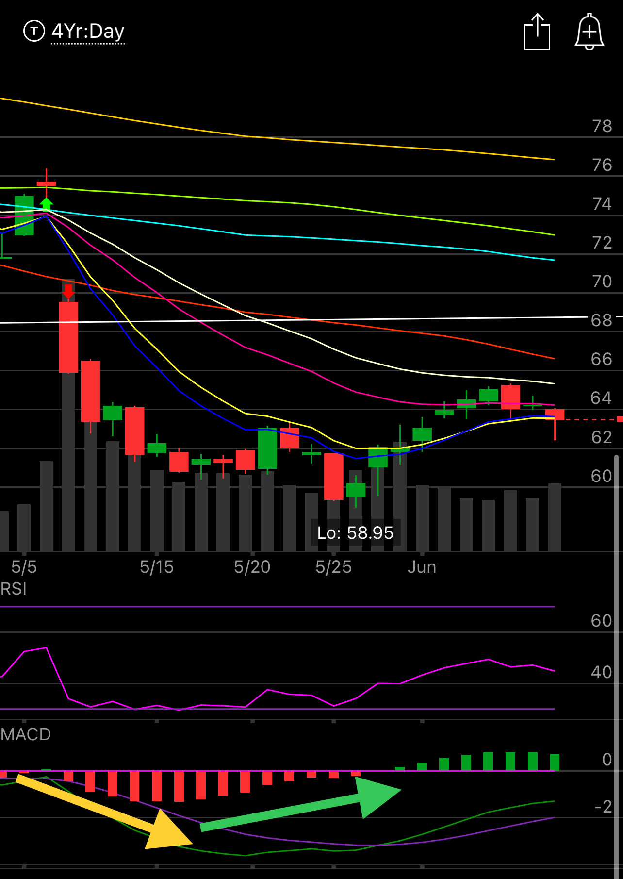
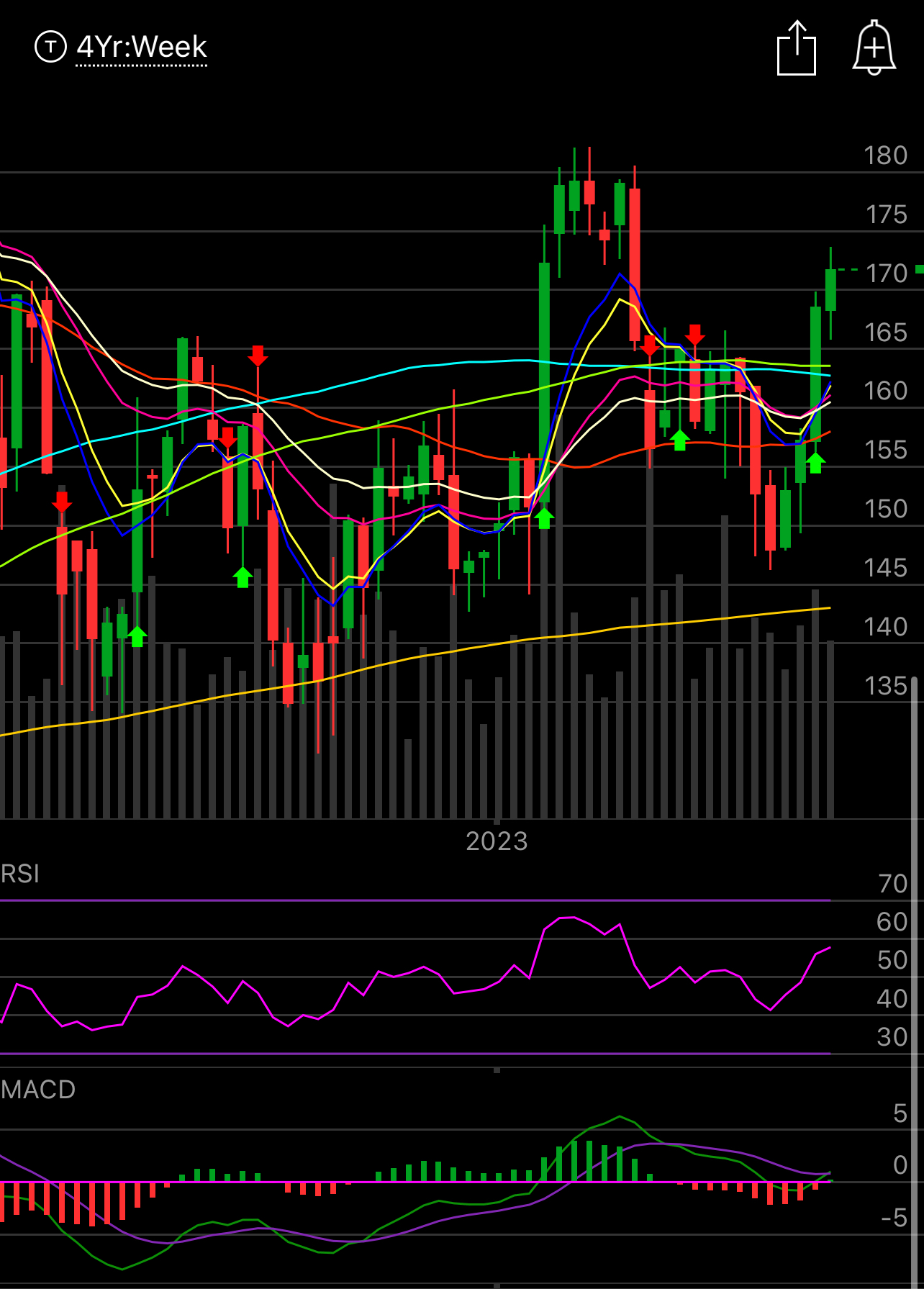
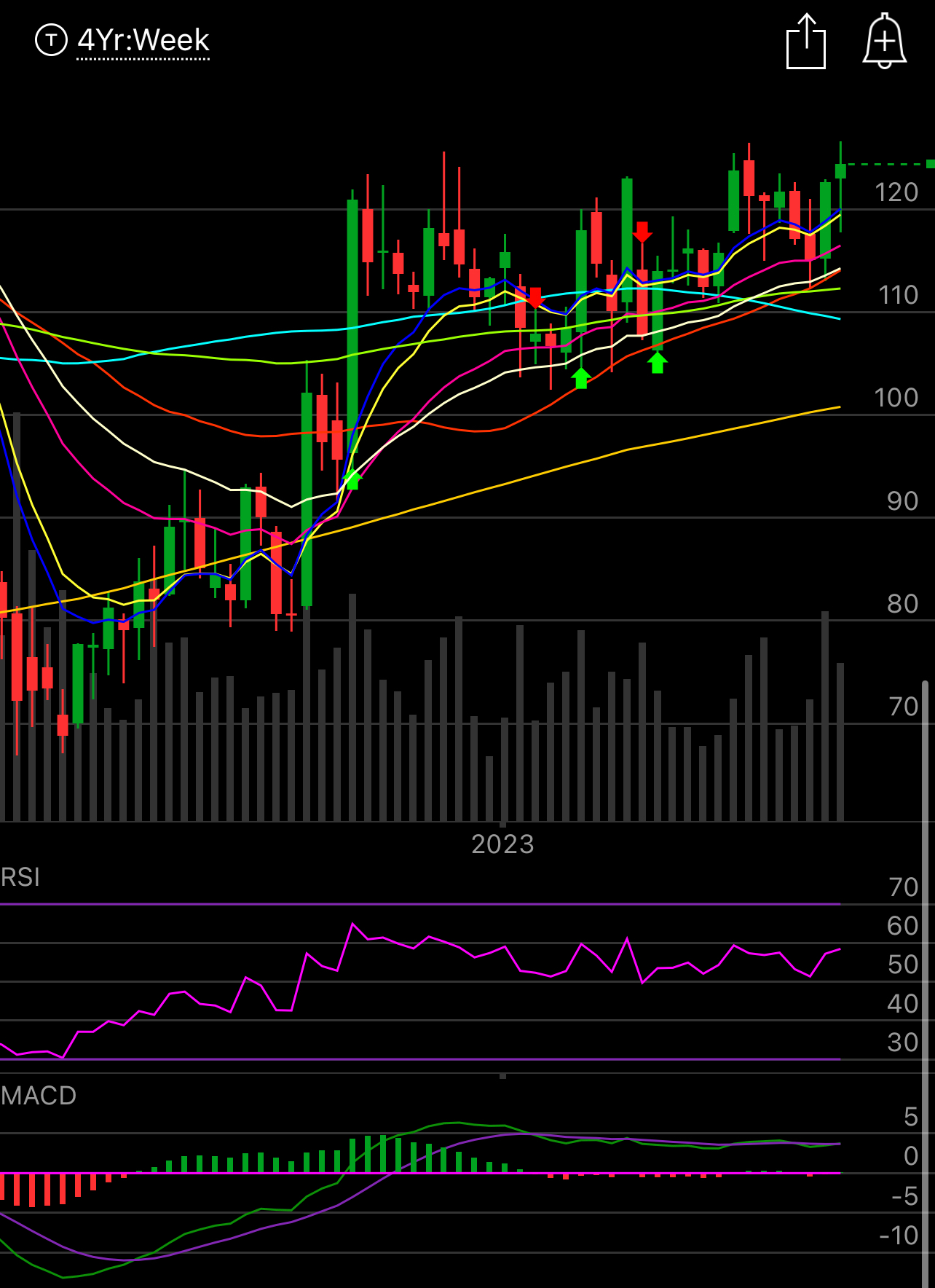
PYPL
One of a zillion payment processors in a race to them bottom, but the P/E ratio is low! Naturally that happens after a stock falls 80% off highs. If the fundamentals are so good, why is the stock so weak? Because the chart is broken and it’s being viciously sold now by both humans and the computers that make up the bulk of trading in the market.
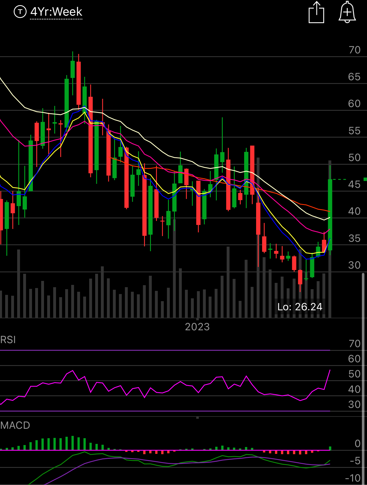
Let’s start with the daily chart. As you can see the breakdown on earnings, fine. When names have good or bad earnings, they tend to drift for a time period, that is the PEAD I always discuss. Post earnings drift, in an ideal world you wait for a name to make it’s earnings move and then you play the trend after. Of course most people enjoy the thrill of the big move on earnings, and that’s fine, live a little, but the right way is to wait for confirmation, and then enter.
As you look at the chart below, what do you see? The yellow arrow is showing the MACD weaken and weaken, meanwhile everyone love to buy the day after the crash like a masochist. Personally, you always have to wait a couple days, yes sometimes you buy the day after and you catch a small bounce, but the likelihood is there will be a multiday period of weakness. In this case it fell another $7, over 10%, from where it closed the first day after the crash over the next 13 days. Meanwhile though about 6-7 days into that, the green arrow is showing, a bullish divergence forming in the MACD. So the stock was showing accumulation, even though it was going sideways to lower for another 6-7 sessions, and then when it ran out of sellers, it began to come back. So you can see the bottoming process occur and when it was actually time to go in. You will see this on nearly every stock that crashes post earnings.
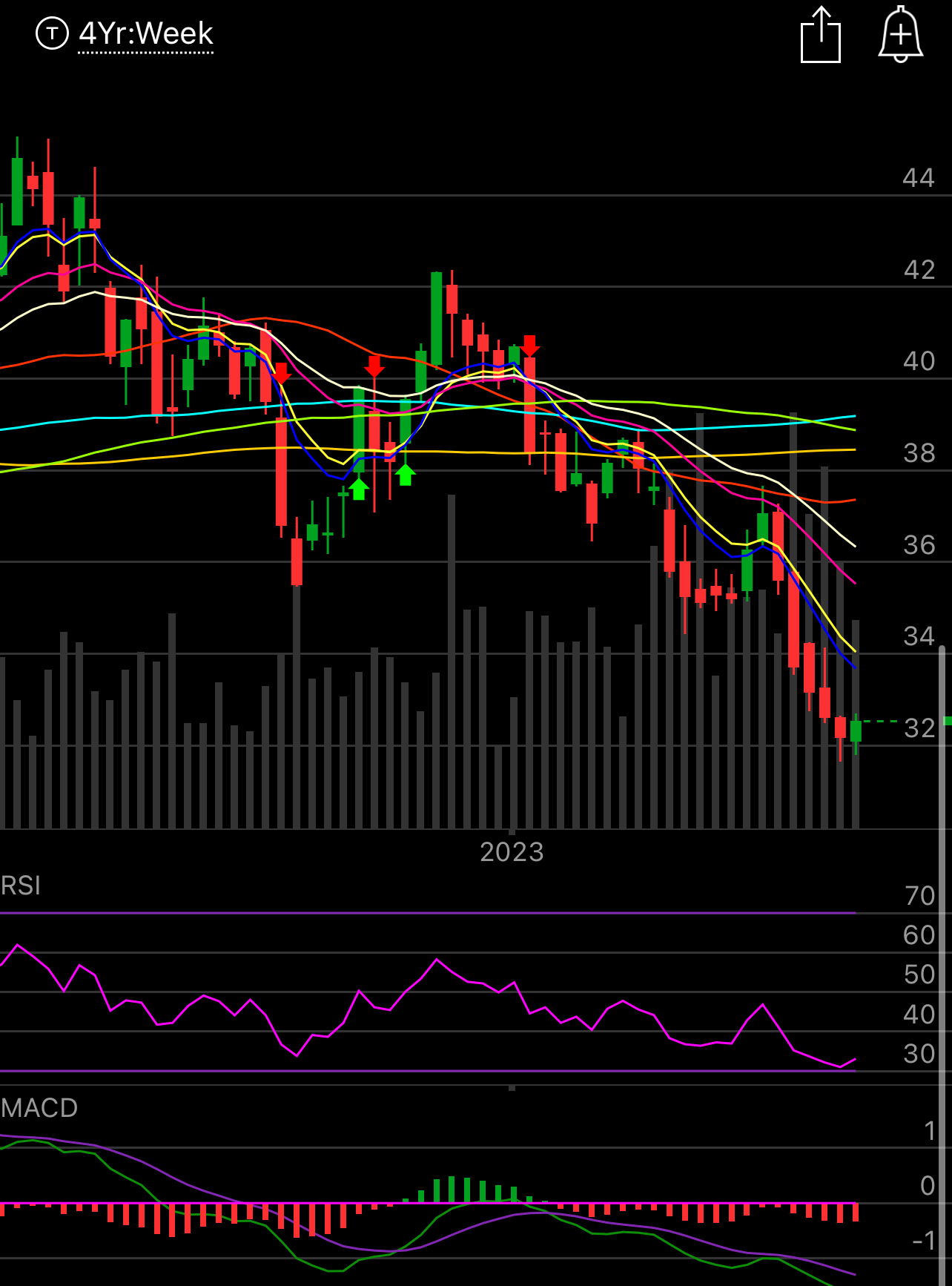
Now, why is PayPal still such a weak stock? This weekly chart will show you more. It broke down from a base that was over a year long. The stock was $300, look where it now, there is so much overhead supply that is going to be selling everyday, that’s why the bottom process takes so long and ideally, when a stock breaks the 200 week average you never touch it, in this case that is the yellow line way up there. The reason being, the 200 week average, is basically the average price of a stock for 4 years, and once you go below it, you have years of buyers pretty much stuck.
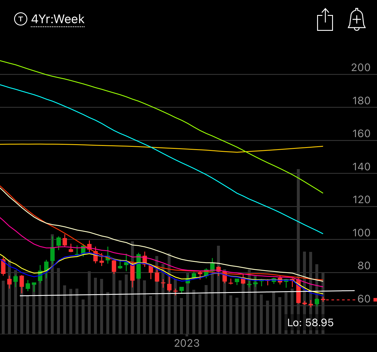
Now, this weekly chart also show all those short term moving averages at the bottom above where PayPal is right now. The stock is still showing immense weakness. That is why I always say wait for a name to be above the moving averages on the weekly chart before you put on a long term position. The chart is telling you that people have been running for the exits, in size, this isn’t time to be a contrarian. You want to ride the wave, you don’t want to be a contrarian. Let the big funds that run the market carry you to glory, don’t try to fight them.
With that said, that’s why I post “strong” setups every Sunday. I go through my scans, I look for charts that show buying! Combine the strong charts with option flows I post and you have a strong basis vs the people looking at balance sheets thinking they matter. Just remember, whatever you think you see in the balance, just remember every hedge fund out there has an army of analysts that sees those numbers and has better models than you. If they’re not buying, it’s not going anywhere. When they do start buying, you’re going to see it in the charts and option flows, long before it shows up in earnings. A bit like what you’re seeing in Amazon today into how it’s rising 50% this year, well before it actually posts a good quarter, that’s because the market is forward looking and those buyers know the next 3 years are going to see something like 50% FCF growth per year. Funds accumulate long before the “news” becomes known and the only way to spot accumulation is through charts. Now a name can disappoint on earnings everyone runs to the exit, that absolutely happens, but the charts themselves, they never lie about is a stock being bought or sold BEFORE news.
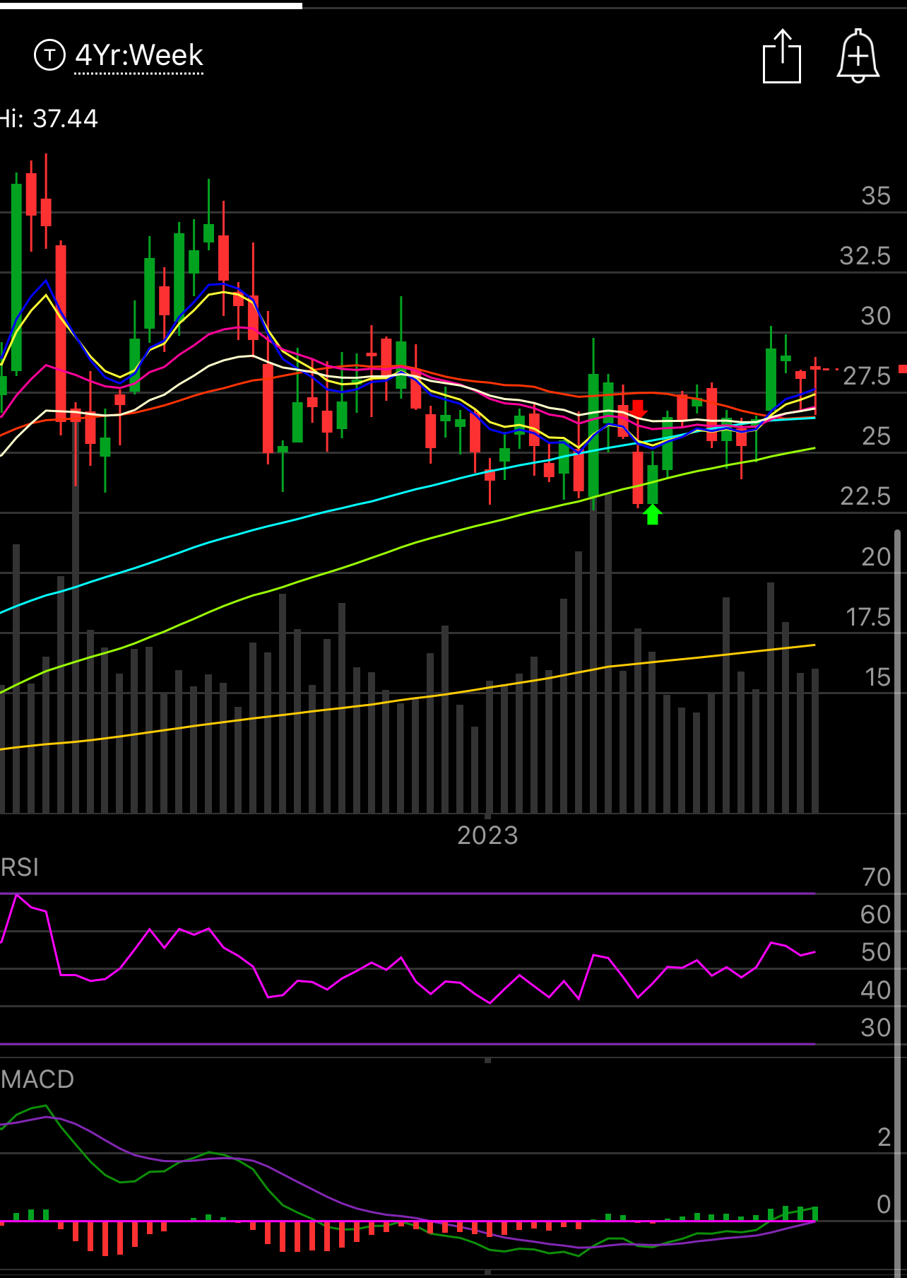
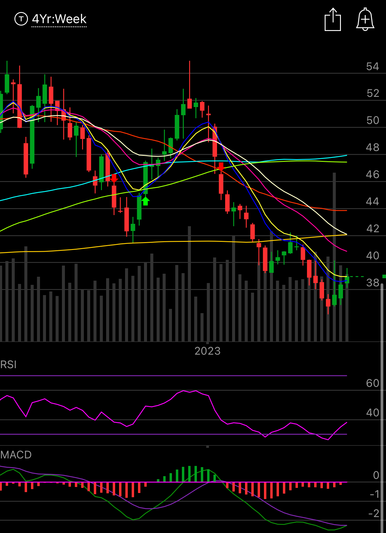
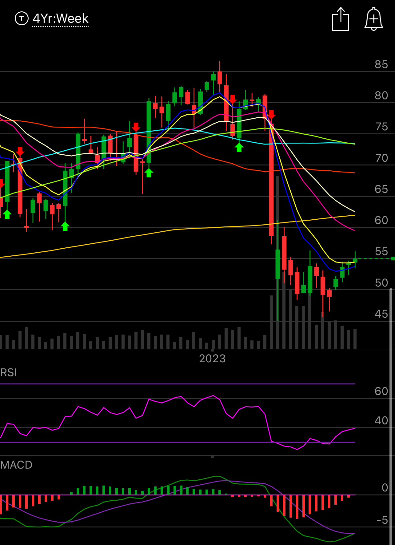
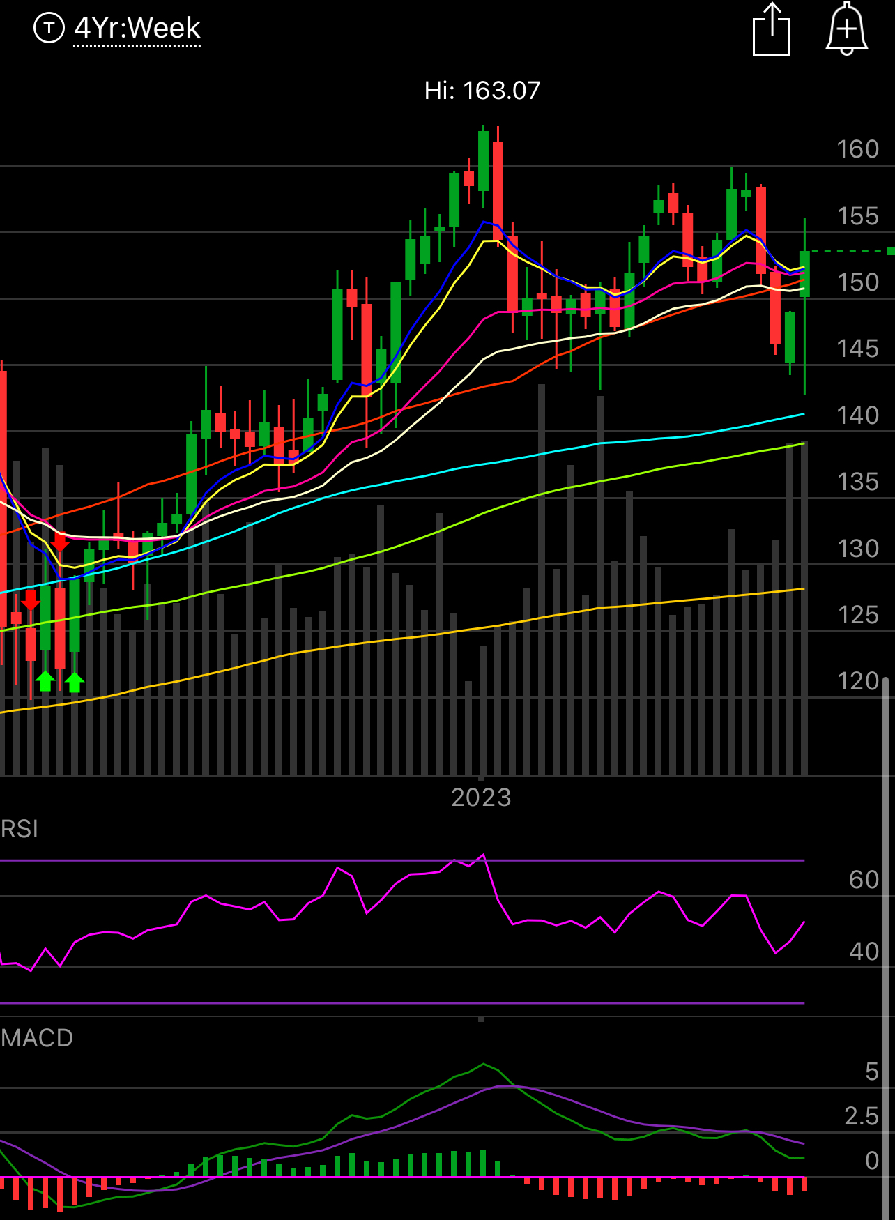
10 Charts Of Strength
Again if you’re looking for short term trades, apply the same concepts to daily charts, I like the weekly/monthly/quarterly charts when looking for a longer term hold/trend. I am using the weekly here. Remember, never run out and buy a stock, even these, always sell puts to enter a position and let the stock come to the level you want.
BA
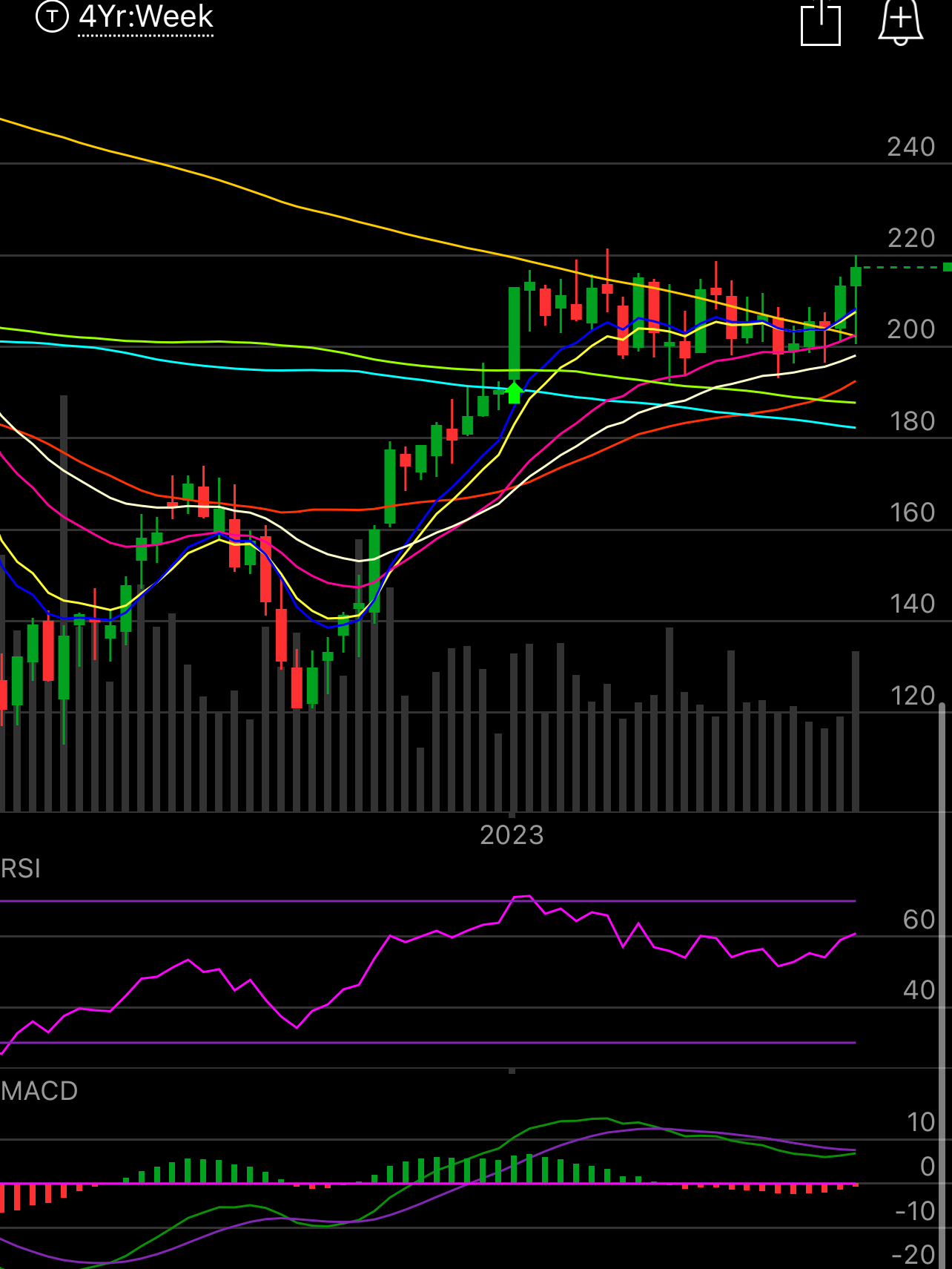
SJM

CBOE
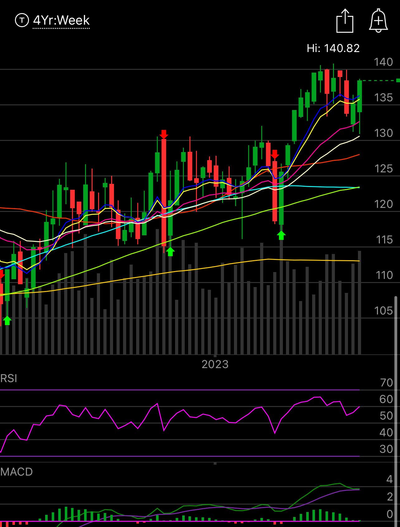
GTLB
RRC
WD

PFE
SCHW
AXP
DXCM

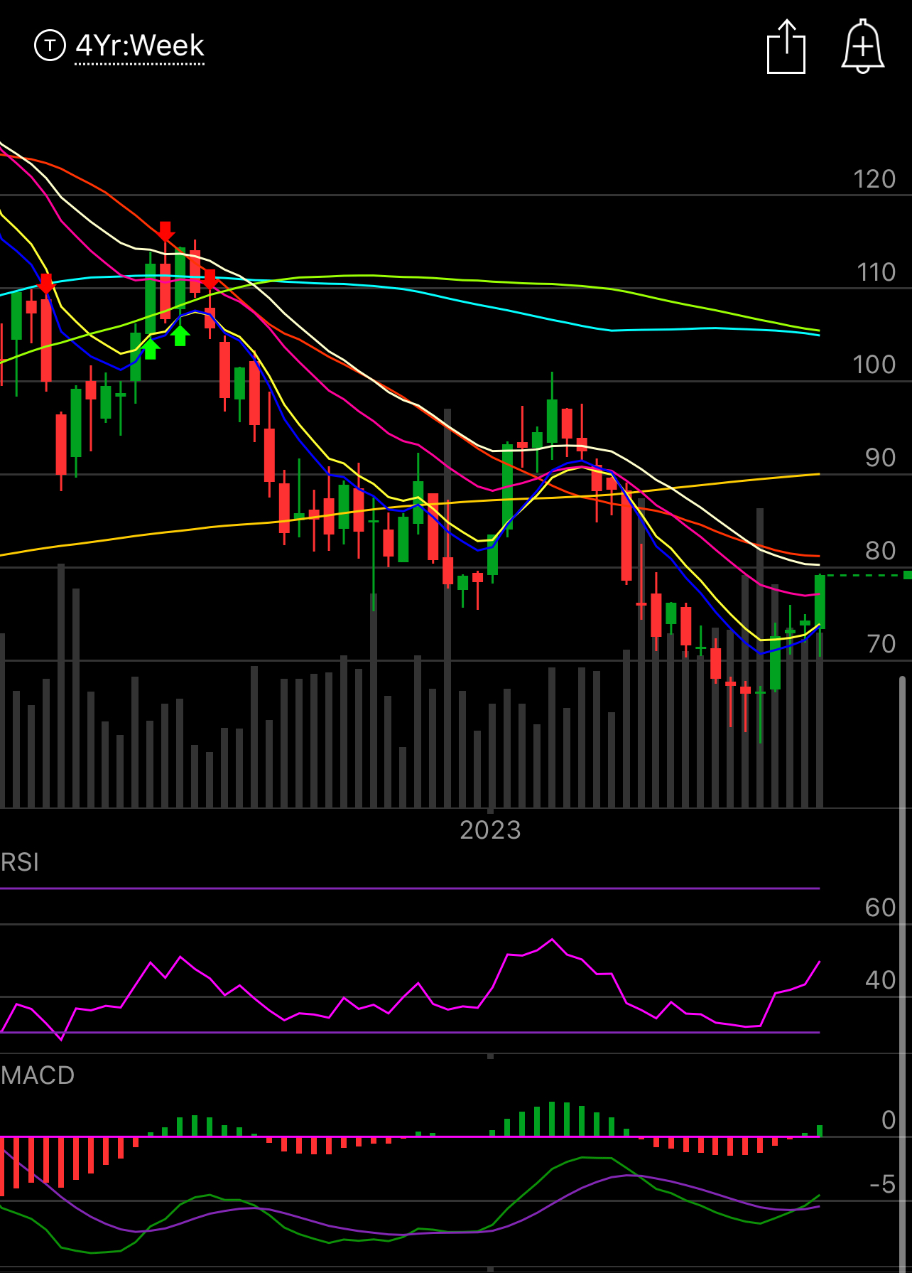
Just remember, you have access to scanners too in your brokerage. Use them. Look for various things. Short term I like to see names over the 8 or 10 ema. Longer term I like to see a bullish engulfing candle on a longer timeframe showing sellers were met with buying. I like to see use the 200 week as a major do or die spot with a tight stop. Over time you develop your own things you look for but at the end of the day, you can buy a good chart, long before you can buy a good balance sheet, because the chart is a reflection of the actual action within the stock. Take BTI, this is a fin twit darling, the P/E ratio is 7 or 8 and it has a 9% dividend and guess what? Nobody cares. Look at the chart below, does that look like a chart full of buyers? It doesn’t mean the company is junk, it’s a very good company, cigarettes have been a great business forever, it just means you’re catching a falling knife buying a name below every moving average that can’t seem to form a bottom. When it bottoms and turns around, go for it.


Anyways, have a great rest of your weekend and I will see you tomorrow.
Hi James, thanks much for these. I just wanna ask - when you post these charts, do you also look at the option flow to supplement the chart data and post them together if available? I've found this combination to be quite informative generally. Just an example - the weekend post on 5/29 highlighting strong charts included both option flow and charts of PSTG, and made me watch it closely - the stock has shot up more than 20% in the week after.
I understand better now how I could interpret the charts and what to look for in them. Thank you for writing this, James.