
7/17/25 Recap

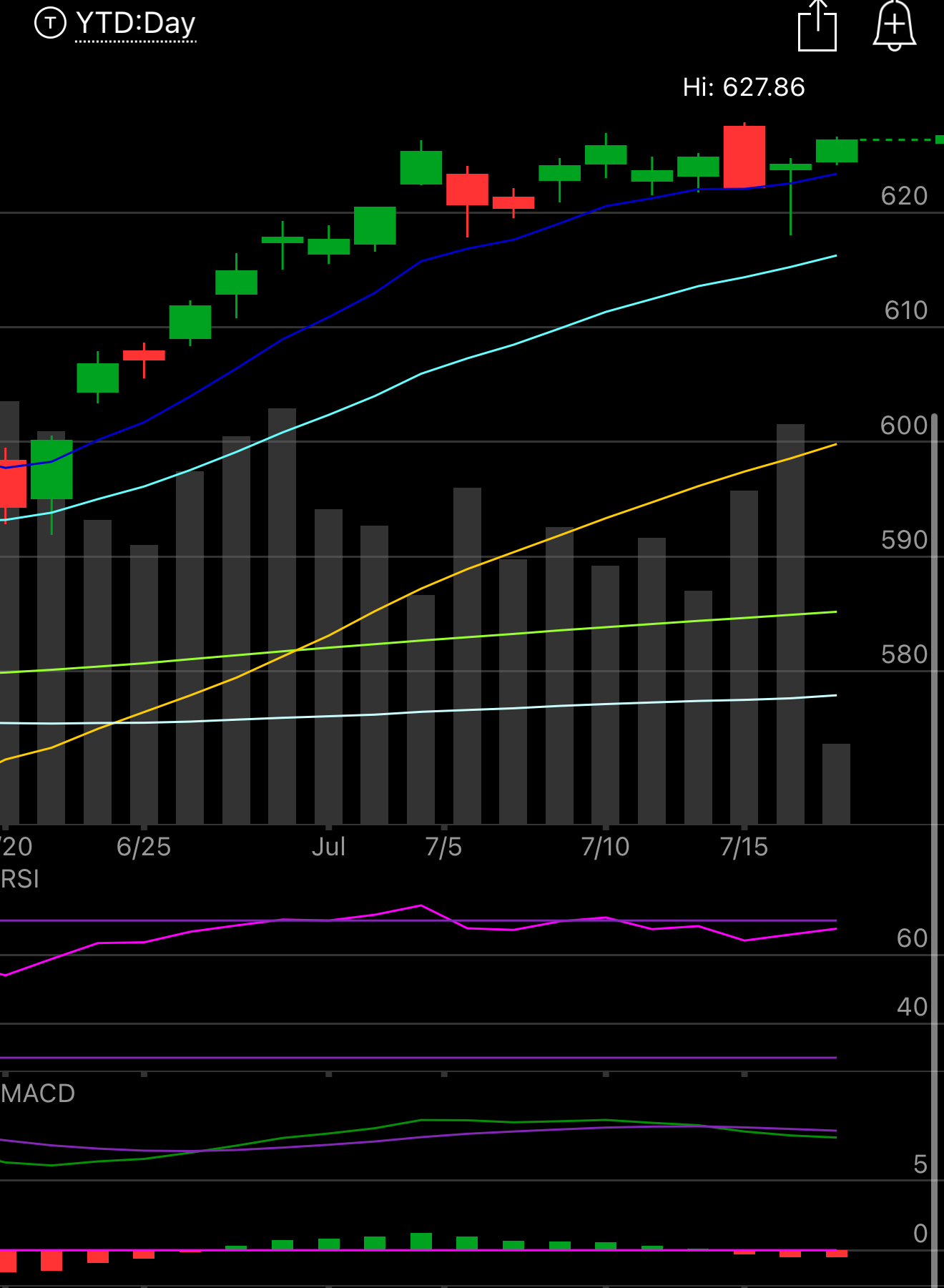
The SPY gave us a pretty big headfake yesterday. We had Anna Paulina on Twitter tuesday night telling us her sources were saying a Powell firing was imminent, then yesterday the news leaked mid day that Powell was potentially fired by August 4th and we dipped. Then as is the case often with Trump, he emerges and says he isn’t thinking about firing Powell even though he constantly bad mouths him and even posted about him again today. The reality is this, I think Trump wants to fire Powell but I also think he saw the market reaction yesterday and pretended like that was never an option. Will he fire him or just continue pestering him until he quits? I don’t know but taking risk off yesterday was prudent and you really did not miss anything as we’re back in the same spot we were at 10 days ago. Is the coast clear? I don’t know but I put risk back on today since Trump seemed to downplay the decision to fire Powell which was all that the market didn’t like. Even notice the chart below, end of day we rallied back over the 8 ema, the algos were happy with the Trump back down.
Changes To The App
I made some changes to the app last night that have been pushed through, now this is the first day and things will get better but it is still a work in progress so there will be some issues we have to fix. The mobile version for instance is not good right now.
Charts - now you have trading view inside the app, for the time being until my application is approved, functionality is limited to just 3 indicators(MACD,RSI, and 1 EMA). It comes default as the 9 ema but you can adjust it to the 8 or 21 but you have to do it everytime, for now. I wanted this to make your life easier, I know most don’t have multiple screens or an ultrawide and toggling multiple screens is a hassle, here you can just search the option flow by ticker and have a chart right there that you can utilize. If you don’t like the chart you just uncheck that show chart button and you’re back to where you were yesterday. Also we had to remove the ticker symbol on the side when you click an individual name because there just isn’t enough real estate to fit it all when the chart is up. I know a few asked about that already but that is why. On mobile it doesn’t look good yet, apologies, working on it, just uncheck the show chart box on mobile for now.
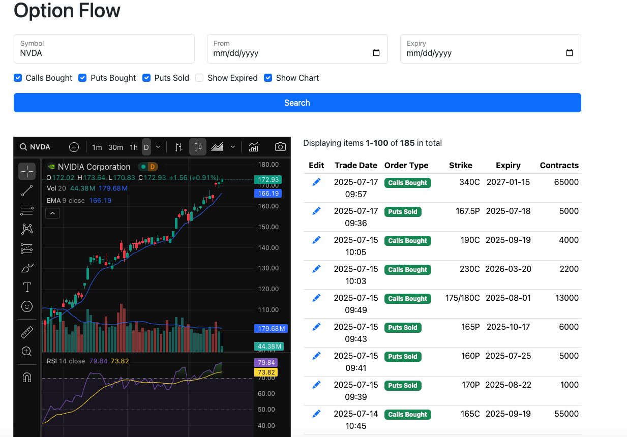
Top/Down - You will notice the option flow is now displayed from most recent trades down, this should have been done a long time ago but it makes it easier for you to see the most recent trades at the top and not have to go to multiple pages for the larger tickers.
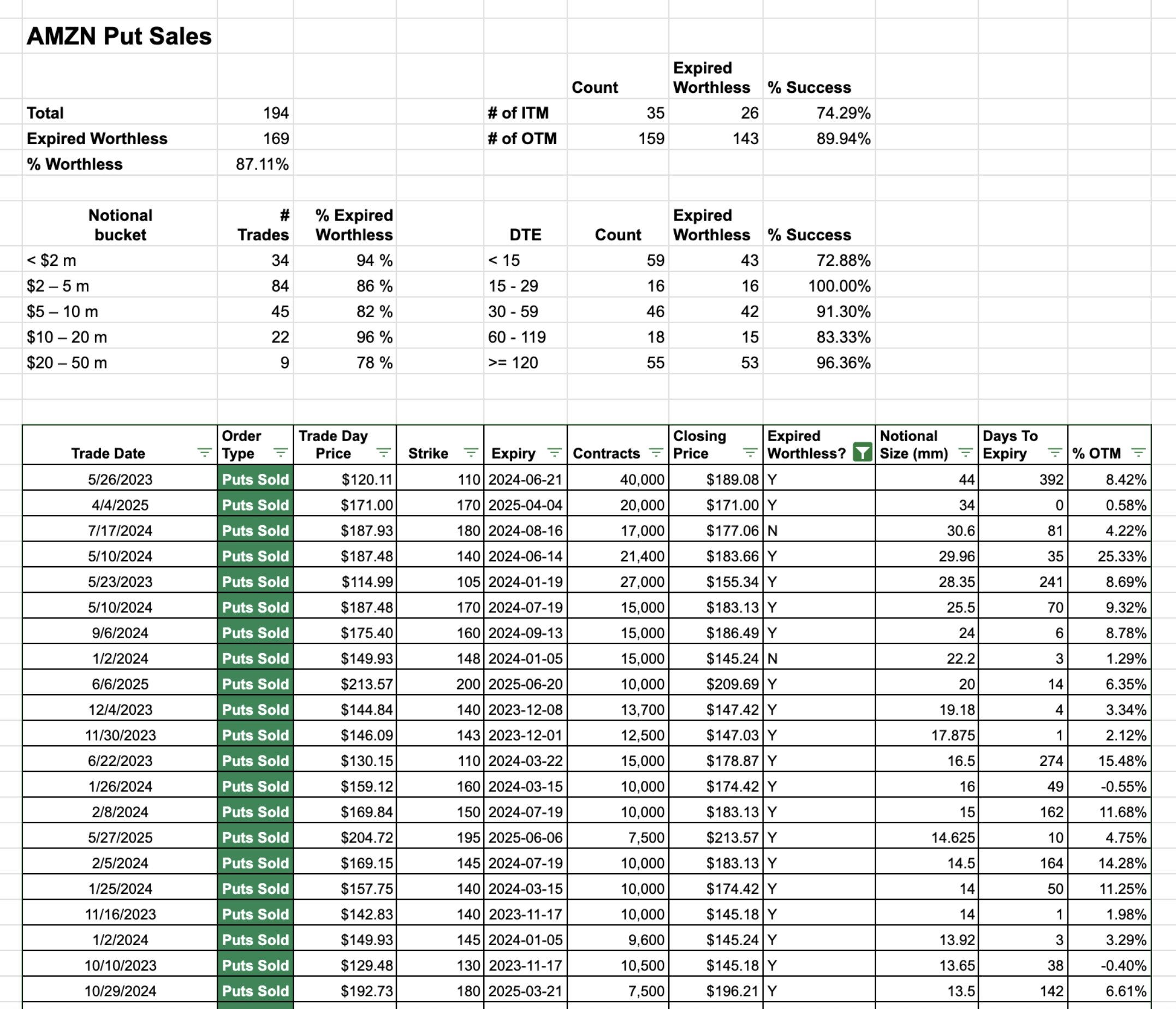
In Progress - I want to display the importance of the put sales I catalog everyday, I’ve always told you those are the most important trades in all this dataset because of their high probability of success which is why you will notice I am mostly a put seller. Down below for example is Amazon and I have logged 194 put sales over the years here and 169 of them expired worthless for an 87.1% success rate. You can see the breakdown by the notional size of the trade, days to expiration,etc. I think this is important to integrate because lets be real with call buys and put buys, we don’t know the intentions of those trades, with put sales we know that’s where someone is looking to get long which is why I think its the most valuable data to trade around. I hope to be able to have this available soon where you can see the data on all the put sales I’ve flagged. So looking at the data below you can say if I see an Amazon trade with short puts 15-29 days to expiry, if I follow that trade, to this point they’ve expired worthless 100% of the time. Very powerful.
I fully get not everyone is going to like every update. What I will say is this, I’m just trying to make your life easier, you save time having the charts in the app right alongside the option flow. I know yesterday within minutes of launching it someone said they didn’t want charts in the app because they had their own and that was right after we initially launched it with the chart only available when you click a button but someone instantly said that they wanted the chart by default. So the reality is, it’s impossible to make everyone happy, there are over 1,000 people who subscribe here, but in general I think if the overwhelming majority find life to be a little bit easier, then these little updates are a win. If in a couple days the feedback is people hate having a chart in the app and want it to go back to what it was before, I will do that too.
My Open Book
Trades I Made Today
